UX design can be a varied field with many factors to consider. So we put together this list of UX design principles to showcase product design in all its glory!
UX design is such a vast field. There’s things we all know and love, like cute little heart icons that turn red when clicked or tapped. But underneath the surface, lies a whole structure of work and effort that UX designers pour into their work.
Free UX Design Tool for individuals and teams

So what are the kind of factors that UX designers need to deal with when creating a new experience for users? What are the game rules that separate a good product from a terrible one? We put together this list of UX design principles that showcase what heroes UX designers truly are, as well as just how diverse the world of UX truly is. Check it out!
User-centered design starts with the user. It’s all about understanding their needs and preferences, not just what the designer thinks is best. You need to really get to know your users to create something they’ll love.
Amazon’s personalized recommendations make shopping easier by suggesting products based on what users have previously bought or browsed.
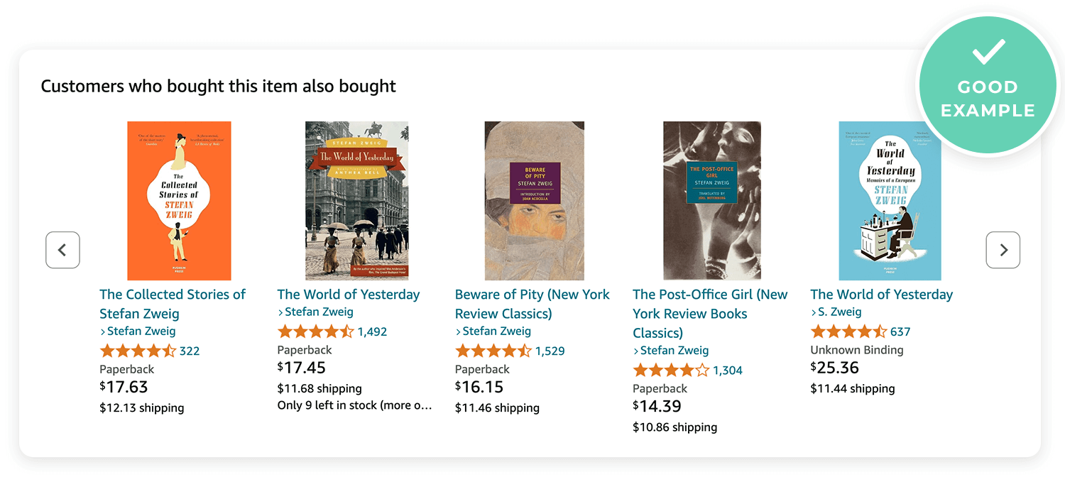
A music app that suggests random genres without considering what the user usually listens to can feel frustrating and irrelevant.
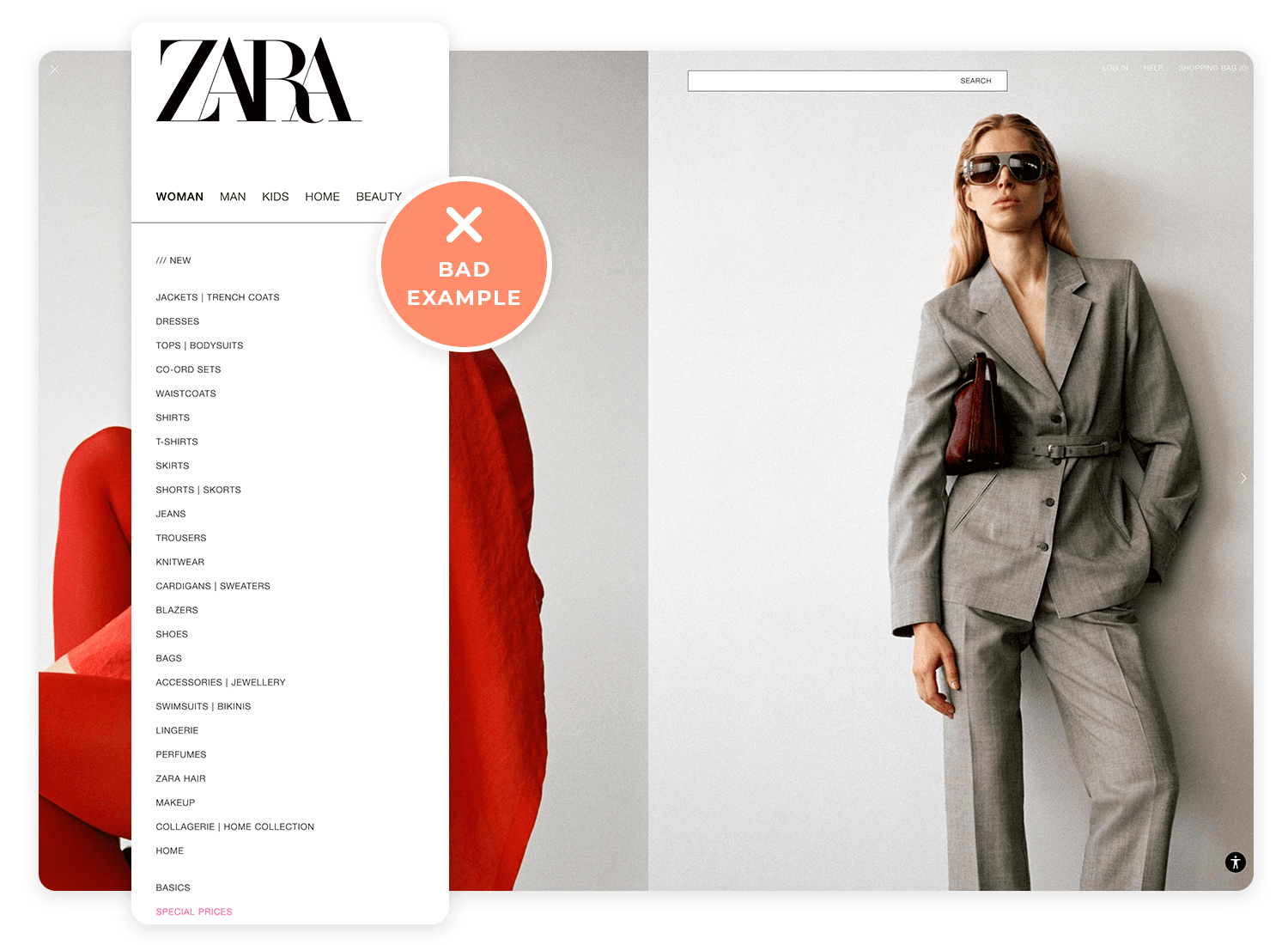
Think of Information Architecture as the blueprint for your design. It’s how you organize content so users can find what they need without getting lost.
Google’s clean and simple search layout helps users quickly find what they’re looking for.
A website with cluttered menus and too many options can overwhelm users, making it hard for them to navigate.
Understanding the situation in which your design is used is key. Whether it’s on a mobile device in a busy environment or at home on a desktop, context affects how users interact with your design.
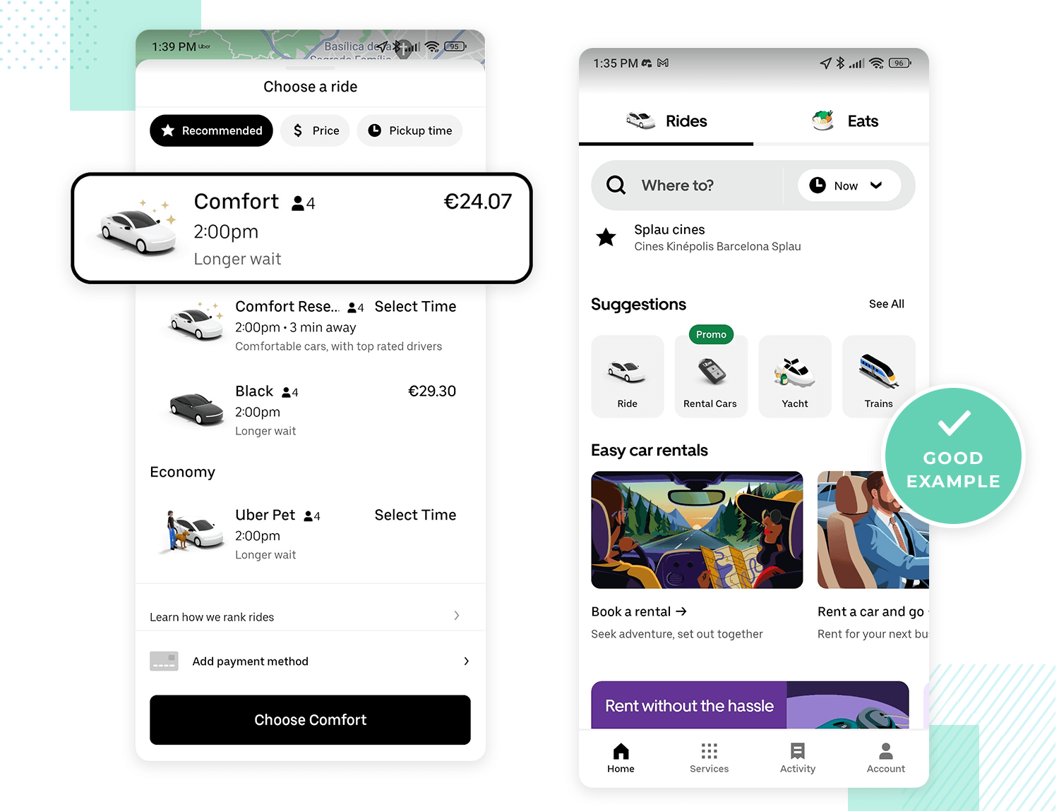
Uber’s app design is great for users on the go, making it easy to book a ride quickly. The app utilizes effective microinteractions, which guide users seamlessly through the process, making it intuitive even in a rush.
A website designed for desktop that doesn’t adapt well to mobile can be frustrating for users trying to access it on their phones. Poor form design on mobile can especially hinder usability, making the experience cumbersome and less user-friendly.
Consistency is what helps users learn how to use your product faster. When everything looks and works the same across the board, it’s easier for users to navigate, improving the overall learnability of the design.
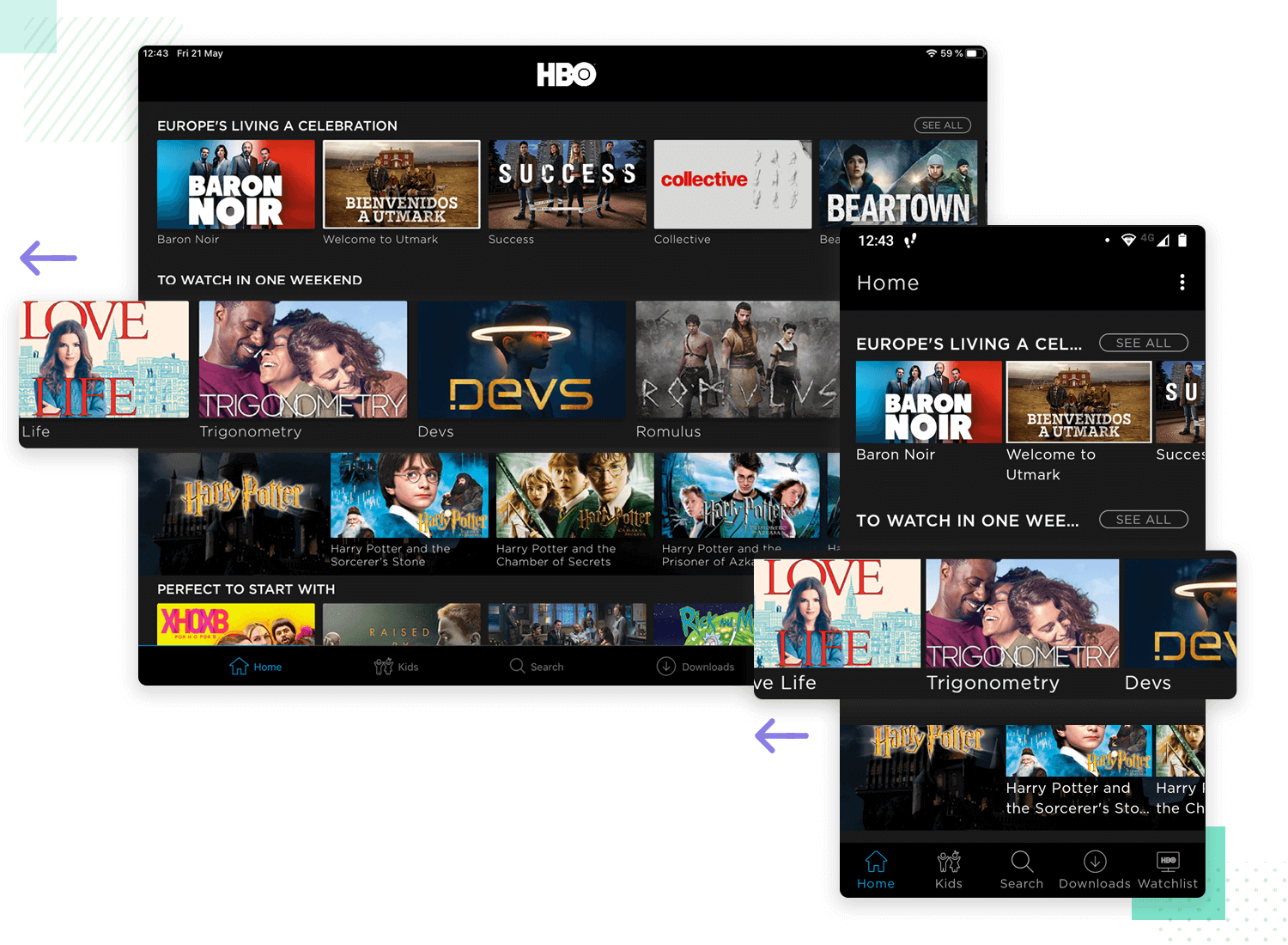
HBO’s consistent design across devices makes it simple for users to switch between a tablet and a phone. The familiar look and navigation help users feel comfortable no matter which device they’re using.
An app where buttons and icons change style and function from screen to screen can confuse users and slow them down.
Free UX Design Tool for individuals and teams

Users like to feel in control, but too many choices can overwhelm them. The trick is to offer enough options to make them feel empowered, but not so many that they feel lost. Techniques like progressive disclosure can help manage this balance.
Spotify’s simple controls let users create and manage playlists easily, giving them freedom without overloading them.
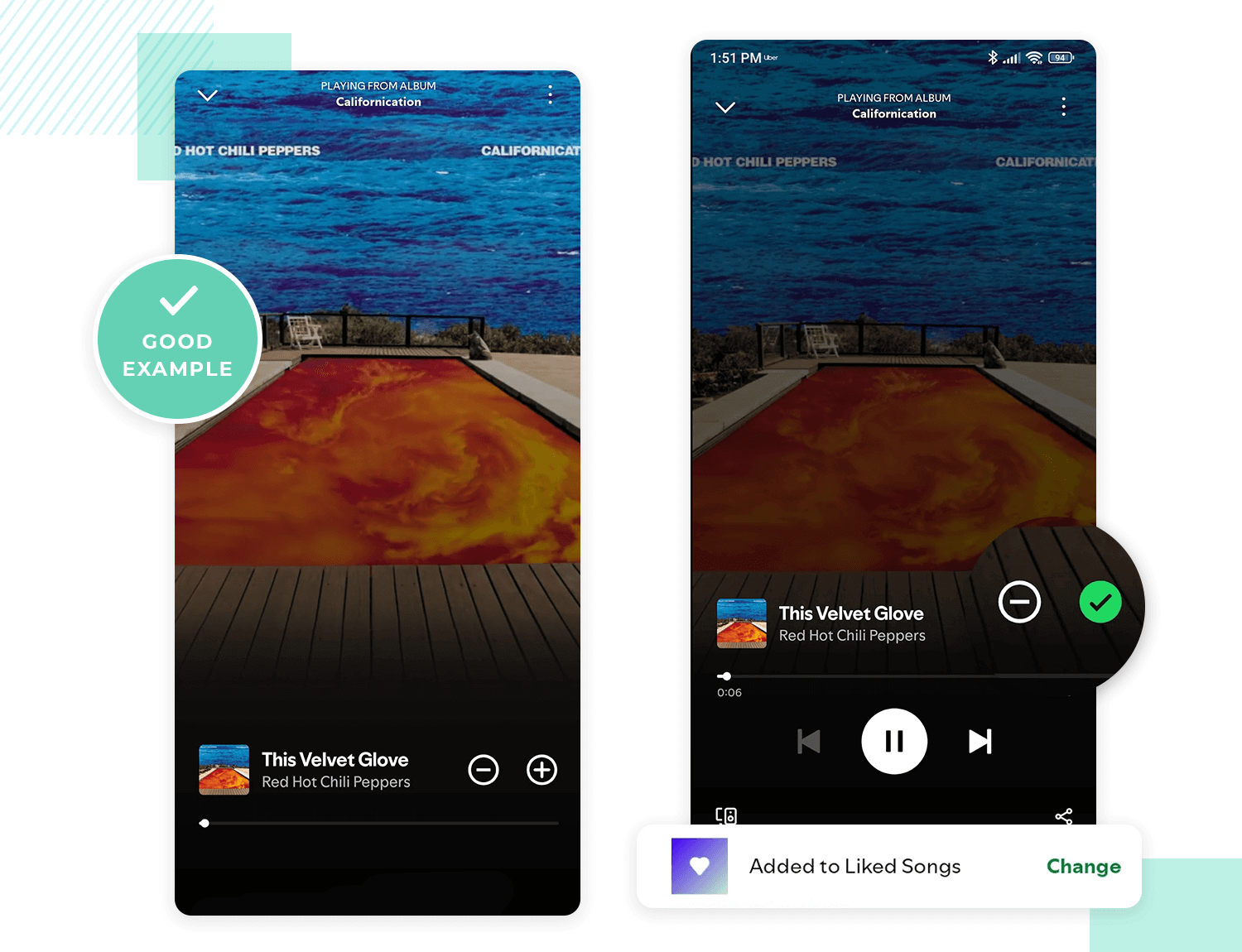
A website that throws too many customization options at users can make them feel lost and unsure of what to do.
Usability is the foundation of good design. It’s about making sure users can get things done easily. If your design isn’t usable, it doesn’t matter how good it looks.
Gmail’s interface is intuitive, allowing users to manage emails quickly with helpful shortcuts.
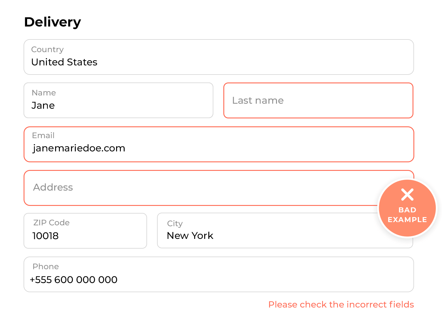
A poorly labeled form with no error messages can frustrate users, making it hard for them to complete it.
Testing your design with real users is the best way to see what works and what doesn’t. It helps you spot issues early and make improvements before launch. Techniques like A/B testing can be particularly effective in comparing different design options and understanding user preferences.
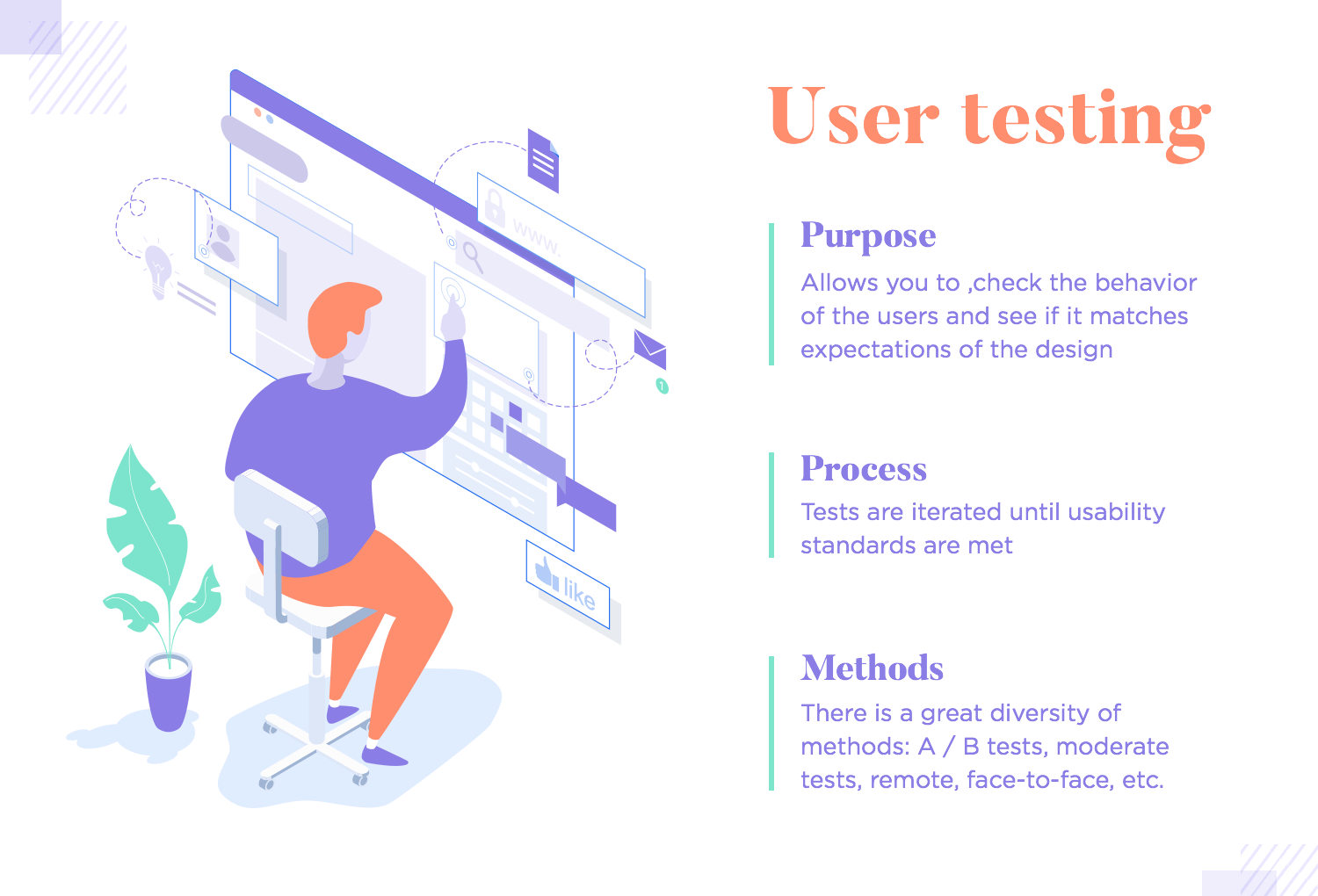
Microsoft regularly tests new features with users to ensure they’re easy to use and meet their needs.
Launching a feature without testing can lead to user frustration and negative feedback.
A simple design often works best. Too many features or visual elements can clutter your interface and confuse users. Focusing on what’s essential can make your design more effective.
Google’s minimalist homepage is a good example. The search bar is front and center, making it easy to use and not cluttered with unnecessary information.
A news site filled with ads and pop-ups can distract users from the content they came to read, making the experience frustrating and less enjoyable.
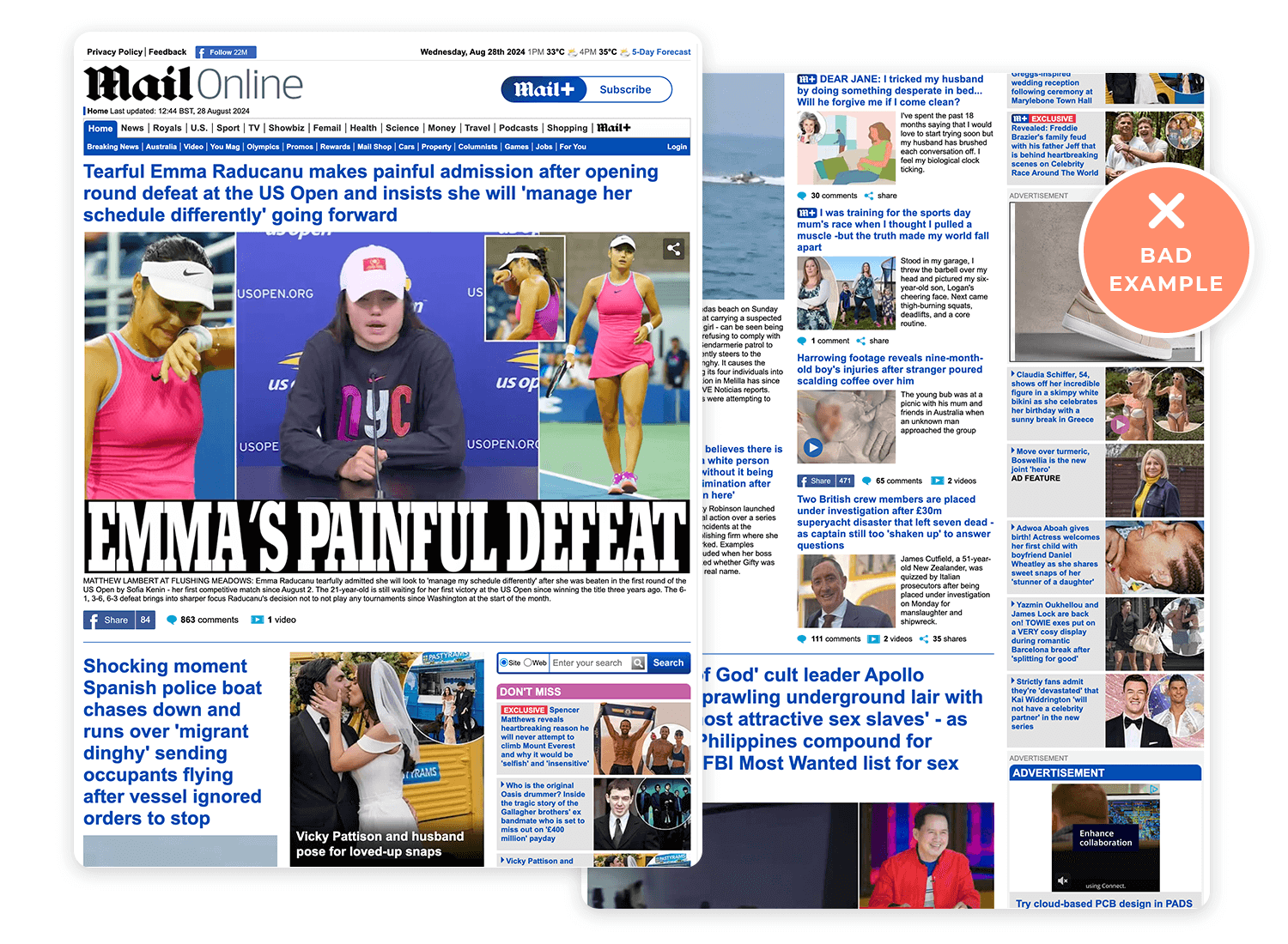
Visual hierarchy is all about guiding users’ attention by making certain parts of your design stand out more than others. It helps users quickly see what’s important.
On Amazon, the product name, price, and “Add to Cart” button are easy to spot, helping users make decisions quickly.
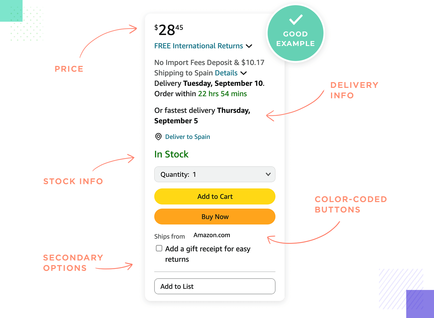
A website where everything looks the same can confuse users because they don’t know where to focus.
Free UX Design Tool for individuals and teams

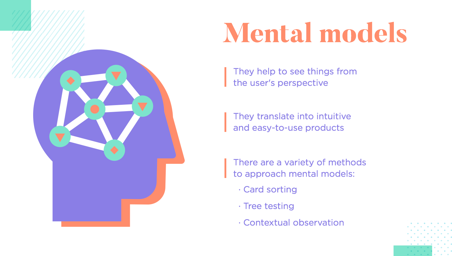
Mental models are the ideas and expectations users have about how things should work based on their past experiences. When your design matches these expectations, users find it easier and more intuitive to use.
Card sorting can help you understand these expectations by showing how users naturally group information, guiding you to design in a way that feels right to them.
Apple’s swipe gestures are a great example. Most users are already familiar with swiping actions on their devices, so using these gestures in apps feels natural and easy.
A banking app that uses unfamiliar icons for common actions, like transferring money, can confuse users and lead to mistakes. If the app designers had used card sorting, they might have discovered how users expect these actions to be represented, avoiding confusion.
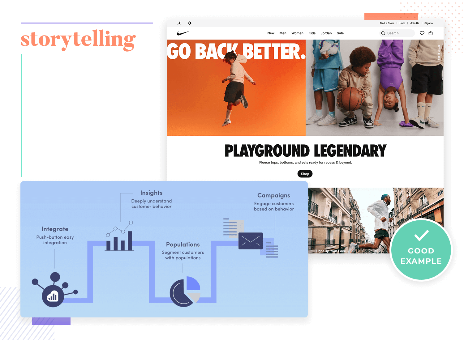
Storytelling in design is like telling a story through your product. It keeps users engaged and makes the experience memorable. Visual storytelling plays a big part here – using images, colors, and layout to create a narrative that resonates with users.
This approach is also important in areas like dashboard design and user onboarding, where clear and compelling visuals help users understand data and navigate your product easily.
Nike’s website uses powerful images and stories to inspire users and connect them to the brand.
A confusing product tutorial that jumps around can frustrate users, making it hard for them to understand how to use the product.
Every seasoned designer knows that jumping straight into a detailed prototype without testing is a mistake. It’s tempting to dive into the final product right away, but it’s smarter to start simple. Begin with sketches and basic wireframes to test ideas and make changes before adding all the details. This way, you save time and avoid big headaches later.
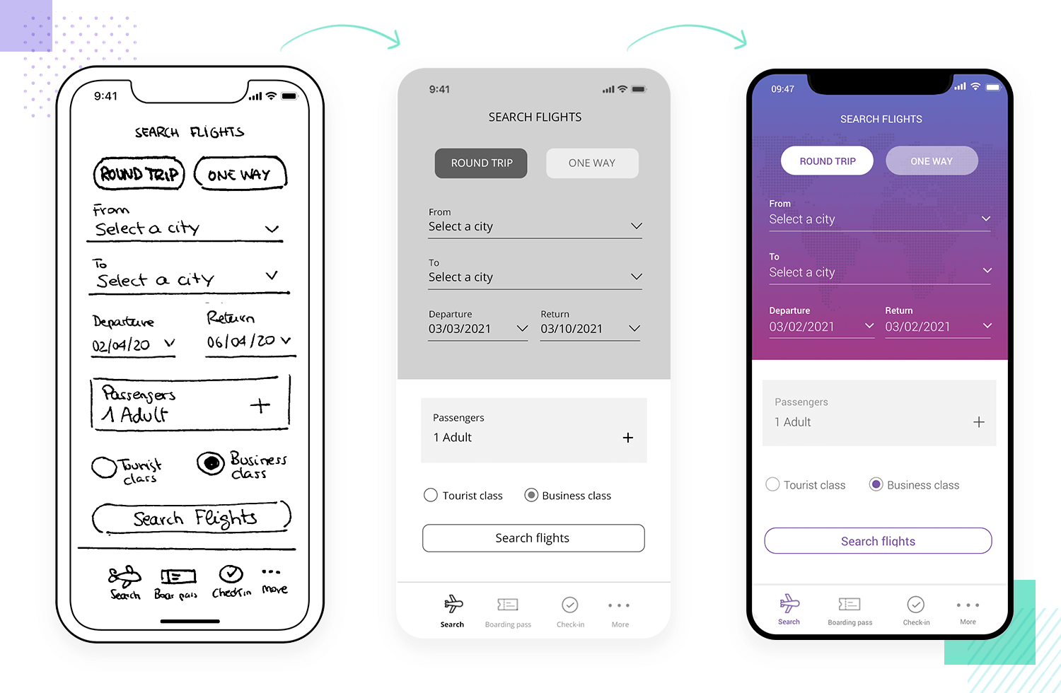
A team starts with rough sketches and simple wireframes, testing different ideas early on. This lets them tweak the design bit by bit, making sure everything works smoothly before going into the final, detailed version.
Jumping straight into a polished prototype without testing can lead to wasted time if it doesn’t meet user needs. You might end up with something that looks great but doesn’t function well, causing major delays and a lot of rework.
Accessibility testing is essential to make sure everyone, including people with disabilities, can use your product comfortably. It’s not just about ticking boxes- it’s about making your product welcoming and easy to use for everyone.
A website that works seamlessly with screen readers and can be fully navigated using a keyboard is a great example of inclusive design. It ensures that people with visual or motor impairments can access everything just as easily as everyone else.
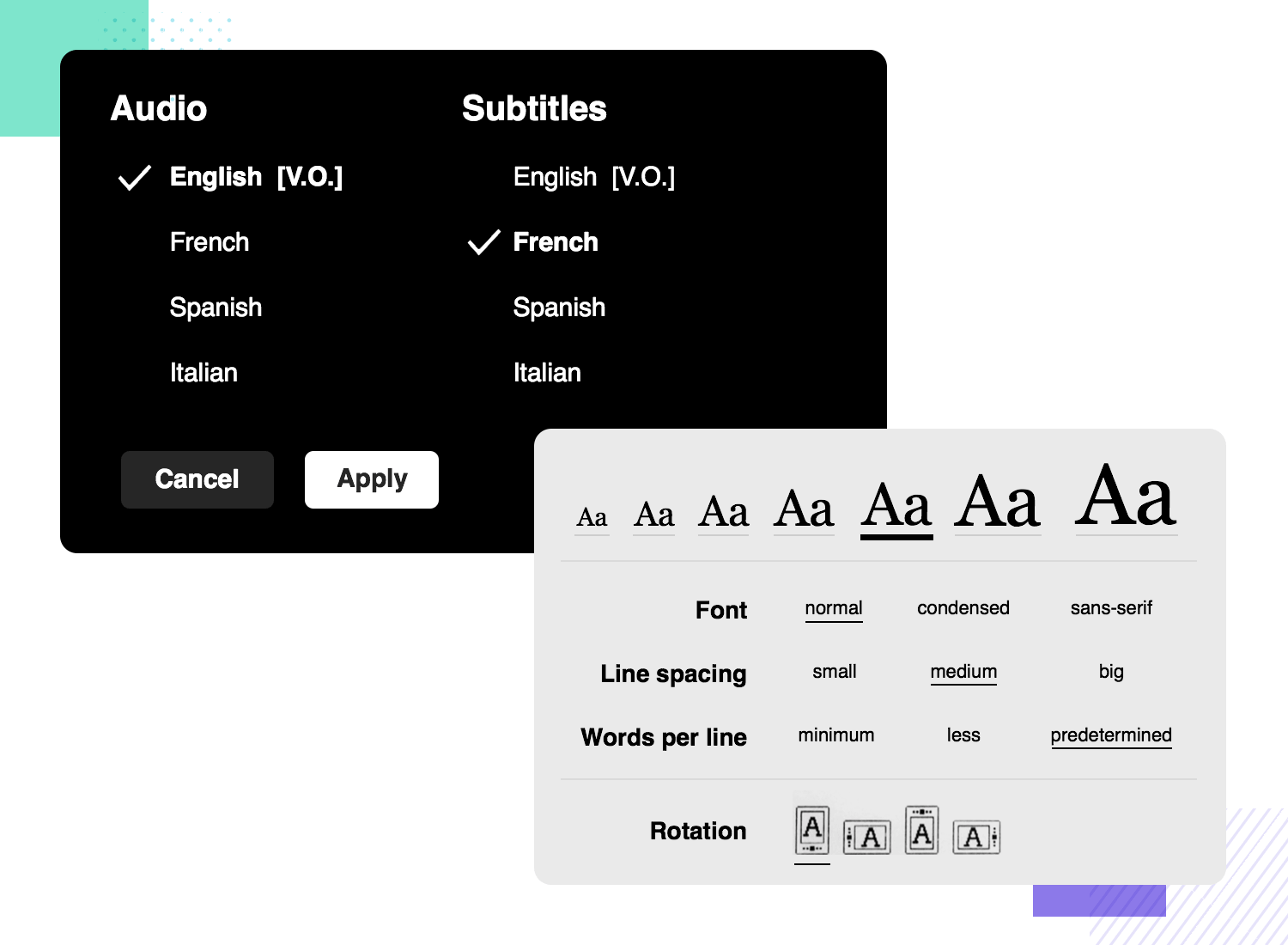
A form that only uses color to show which fields are required can be really frustrating for color-blind users. Without other cues, they might not realize what’s needed, which can lead to mistakes and a bad experience. Small details like this can make a big difference in whether your product feels accessible or not.
By now, we know that offering users a consistent design helps users feel comfortable and reduces the time they need to learn how to use your product. UI design principles also play a crucial role in achieving this consistency across platforms.
For example, there are certain UI components that most users will immediately recognize. This means that they will instinctively know what that component will do and more or less how it will behave. Classic examples include the hamburger menu icon or radio buttons.
Most websites put the shopping cart icon in the upper right corner, where users expect it to be.
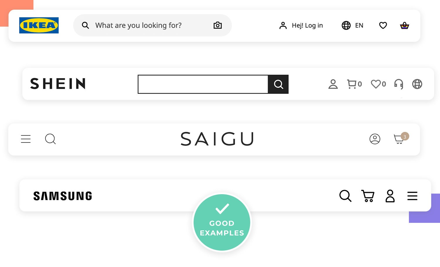
A new app that places common icons in unusual spots can confuse users who are used to finding them elsewhere.
Free UX Design Tool for individuals and teams

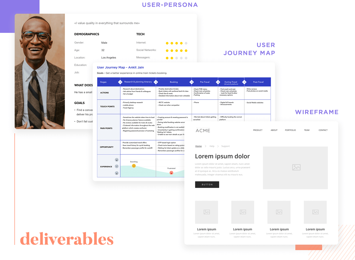
UX deliverables, like personas, wireframes, user journey maps, and prototypes, are key tools that help share ideas and guide the design process. They keep everyone on the same page and focused on creating something users will love.
Creating user personas helps the design team stay clear on who they’re designing for. It’s easier to make decisions when you know exactly what your target audience needs and wants.
Skipping a sitemap can make a website feel messy and hard to navigate. Without a clear plan, users might struggle to find what they’re looking for, leading to a frustrating experience.
Having a solid prototyping tool is crucial for quickly creating, testing, and refining your designs. It’s what helps you turn ideas into something tangible and lets you make adjustments based on user feedback.
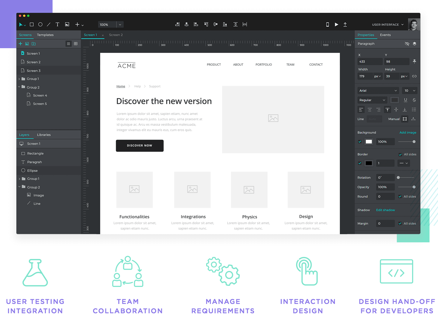
Using a UX design tool like Justinmind allows teams to collaborate in real-time, making it easy to adjust designs and test them with users immediately. This speeds up the design process and ensures that everyone is aligned and working towards the same goal.
Relying on basic drawing tools for prototyping can really slow down progress. These tools often lack the necessary features to fully test your design, which can lead to issues that are harder to fix later on.
Keeping track of what needs to be done is super important for staying on course with your project. By regularly requirements management, you make sure that everything important is covered, and the project stays focused on its goals.
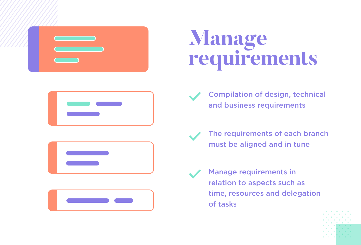
Having a clear and regularly updated list of what needs to be done helps the team stay in sync with both user needs and project goals. This organized approach avoids misunderstandings and keeps things running smoothly.
If the technical and design requirements don’t match up, you could end up with a product that looks good but doesn’t work right. This mismatch can cause big delays and expensive rework.
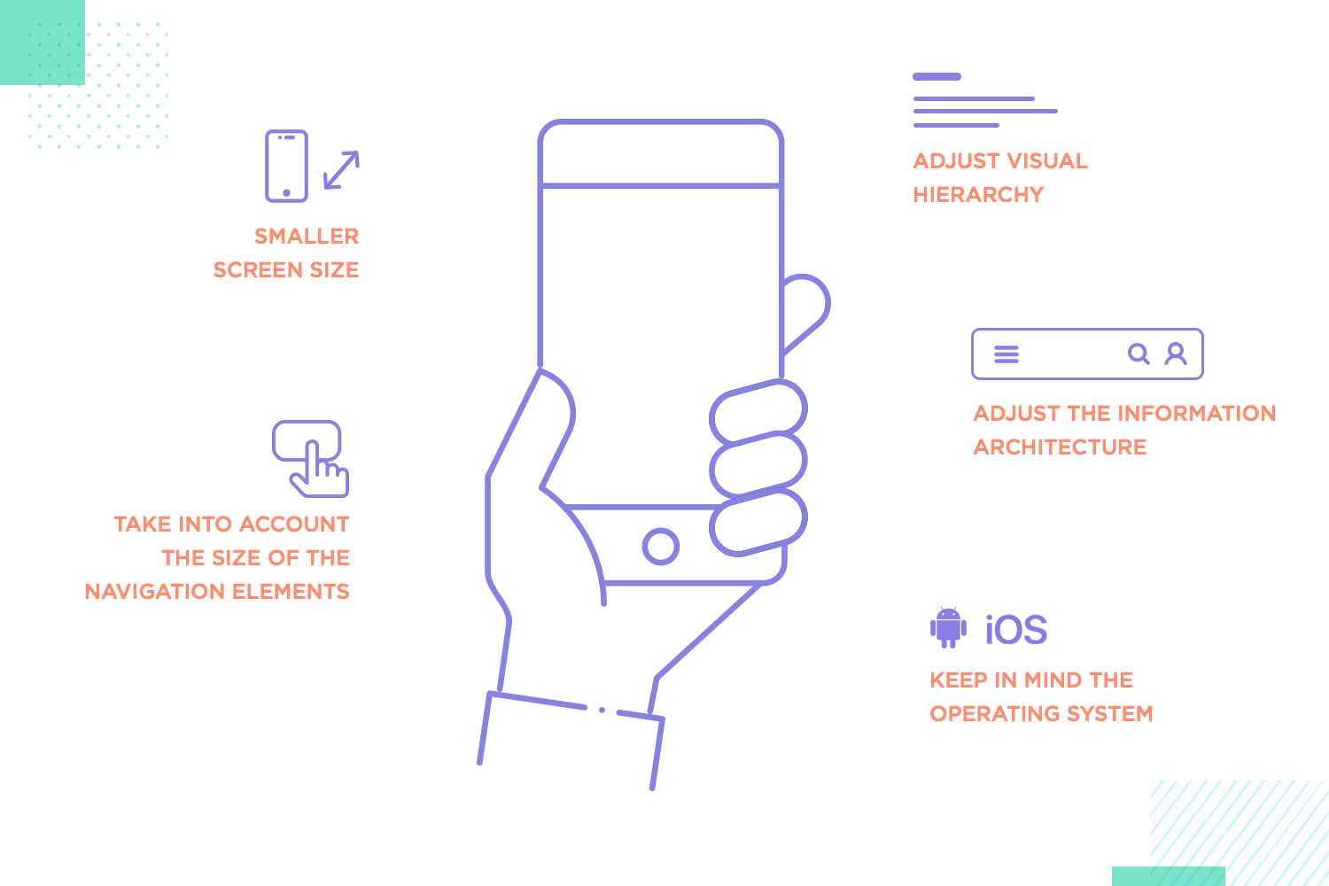
As we mentioned before, designing for mobile and web isn’t the same. Different screen sizes and how people use these devices mean you need to design differently to make sure everything works well.
A mobile banking app with big buttons and clear icons makes it easy for users to navigate and get things done on a small screen. This kind of design considers the unique needs of mobile users, making the experience smooth and easy.
A mobile site that’s just a shrunken version of the desktop site can be frustrating, especially if it doesn’t work well with touch screens or small displays. This can lead to a bad experience for mobile users.
UX design patterns are tried-and-true solutions for common design problems. Using these patterns can save time and make sure your product is easy to use because they’re based on what has worked well before.
Adding “infinite scroll” on a social media app keeps users engaged by letting them keep discovering new content without stopping. This pattern makes the experience seamless and keeps users hooked. However, if the infinite scroll is not implemented carefully, it can lead to frustration.
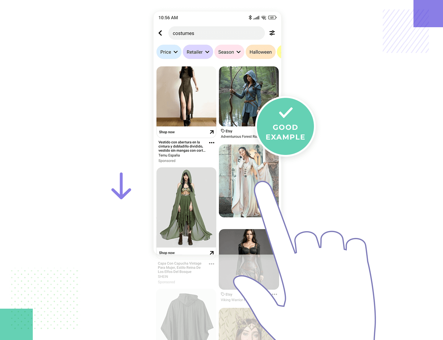
Skipping established design patterns to create something totally new can make your product harder to use. Users might spend more time trying to figure out how it works instead of enjoying.
As a UX design principle, it’s always preferable to have the right tools. The right tools make it easier to prototype, test, and collaborate, which leads to a better user experience.
Using a mix of tools for prototyping, testing, and collaboration helps keep the design process smooth from start to finish. This way, teams can bring their ideas to life and improve them based on feedback.
Using outdated or limited tools can slow down creativity and the project, making it harder to meet deadlines and deliver a quality product. Having the right tools keeps things moving and helps produce great results.
UX design is its own world. There’s a sort of magic to how many different areas and topics UX design teams touch and work with. It’s fast, exciting and methodical work that can be exhilarating. We put together this little list of UX design principles in hopes of giving you an overview of the sector, but even we know that this only scratches the surface.
The very roots of UX design go back way before digital products and nobody knows just where it will lead us in the future. We do know, though, that whatever it brings us will definitely be interesting.
PROTOTYPE · COMMUNICATE · VALIDATE
ALL-IN-ONE PROTOTYPING TOOL FOR WEB AND MOBILE APPS
Related Content
 Expert advice to help you create stunning UX flowcharts that help identify what users need and how to give it to them20 min Read
 Looking to get ahead in your UI-UX design career? Look no further. We’ve gathered the best of both online and in-classroom UX design courses to boost your CV!15 min Read
 UX design portfolios are your chance to showcase your top skills and best work. Check out this post for awesome portfolio examples and websites!10 min Read


